Visual Branding & Graphic Design
Design That Speaks Your Brand's Language.
From logos to launch-ready assets, explore how I bring brands to life with strategic, scroll-stopping design.
Canpar Express
During my 10-year tenure at Canpar Express, I was instrumental in establishing their marketing department in 2018. Directing all visual communications across print and digital channels, I strategically shaped the brand's presence in competitive B2B and B2C markets. My leadership extended to launching and managing their social media presence (LinkedIn, Facebook, Instagram) and successfully project-managing a complete website overhaul in 2020. My work spanned executive presentations, national ad campaigns, internal initiatives, and stadium signage—always prioritizing clear, consistent, and strategic design. This collection showcases how I harmonized creative vision with measurable performance to significantly elevate Canpar’s brand across all platforms.
Social Media
In 2018, I proudly spearheaded the launch and strategic growth of Canpar Express's social media presence across LinkedIn, Instagram, and Facebook. Through consistent, varied content posting and targeted engagement strategies, I successfully grew the LinkedIn following organically to over 4,200 engaged followers by the time of my departure in May 2022, significantly amplifying Canpar's brand reach and presence.
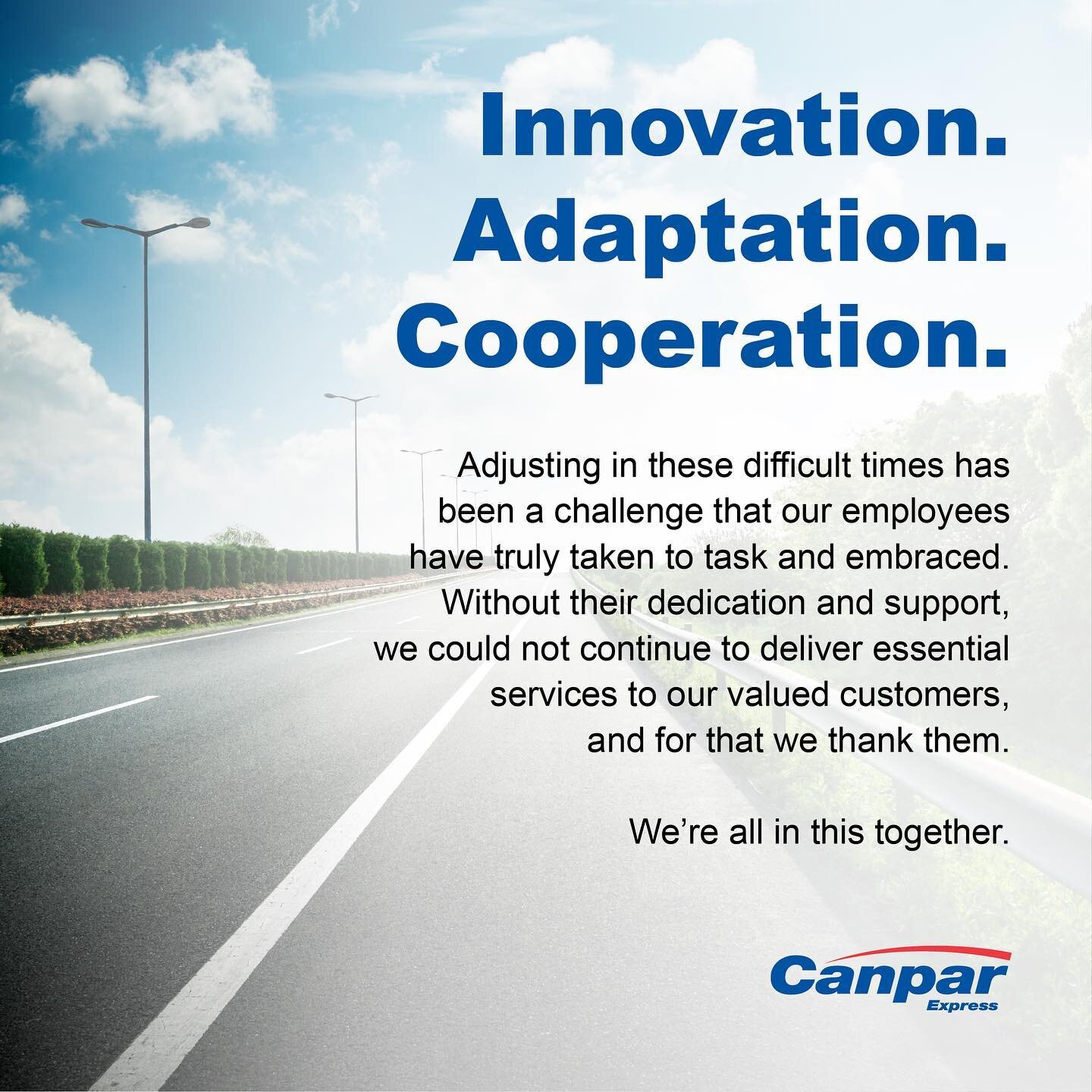


Supporting Brand & Marketing Assets

Driving Employee Advocacy for Canpar Express on LinkedIn.
Created to counter a fraudulent LinkedIn account, this visual was used in an internal email campaign which encouraged Canpar Express employees to become active brand ambassadors. By guiding them to update profiles and engage with the new official page, this initiative successfully boosted authentic traffic, amplified brand awareness, and cultivated a unified professional digital footprint for the company.
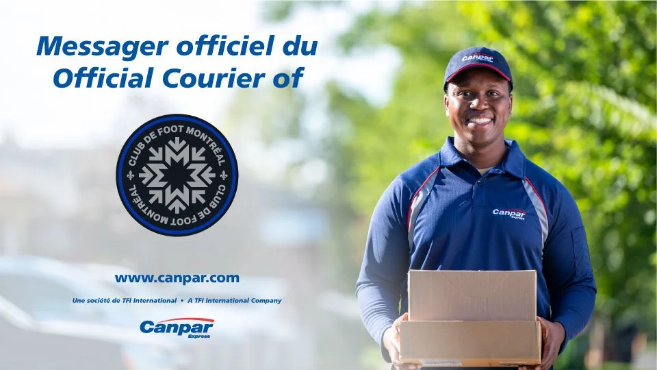
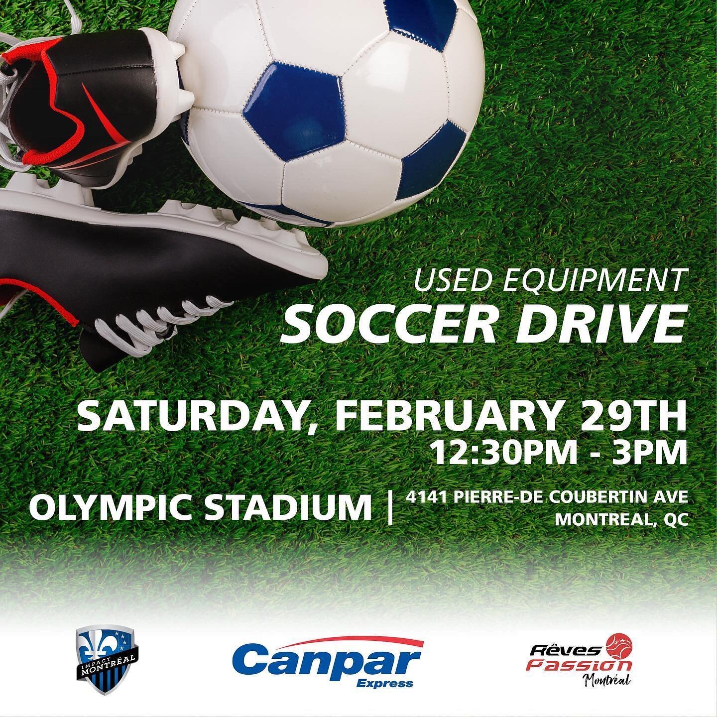
In-Stadium Digital Advertising for Brand Partnerships.
Developed for Canpar Express's collaboration with CF Montréal, this visual communicates the "Official Courier" status to a key audience. Its placement on Stade Saputo's concourse TVs ensures high visibility, effectively reaching thousands of soccer enthusiasts and cementing Canpar's presence within the sports community.

Canpar Express President's Award Signature Badge.
Designed as a digital asset for winners of the 2020 President's Award for "Excellence in Customer Service." This badge allows recipients to proudly display their achievement in email signatures, subtly communicating Canpar's commitment to quality.
GoRight Fleet Solutions & Wabash Canada
Since May 2022, I've actively driven the visual communications and brand strategy for GoRight, Wabash Canada, and Mirlin Technologies, significantly impacting their market presence. My core contributions include developing comprehensive brand guidelines for Mirlin, ensuring consistent brand voice and visuals across all touchpoints. I owned the logo design process, notably for the GoRight FleetCare Service, various Mirlin product logos, and the complete redesign and rebranding of Wabash Canada.. Furthermore, I consistently produced impactful PowerPoint presentations for key initiatives and spearheaded the successful launch and organic growth of their social media channels (LinkedIn, Instagram, Facebook), achieving impressive organic growth of over 2,400 LinkedIn followers for Mirlin and 1,200 for GoRight within a year.
Social Media

At GoRight, I led the strategic growth of our social media presence across LinkedIn, Instagram, and Facebook. Through consistent, varied content publishing and targeted engagement strategies, I successfully grew GoRight's LinkedIn following by over 1,200 within one year (May 2022-2023), significantly amplifying brand reach and engagement.

Concept logos


Logo Design
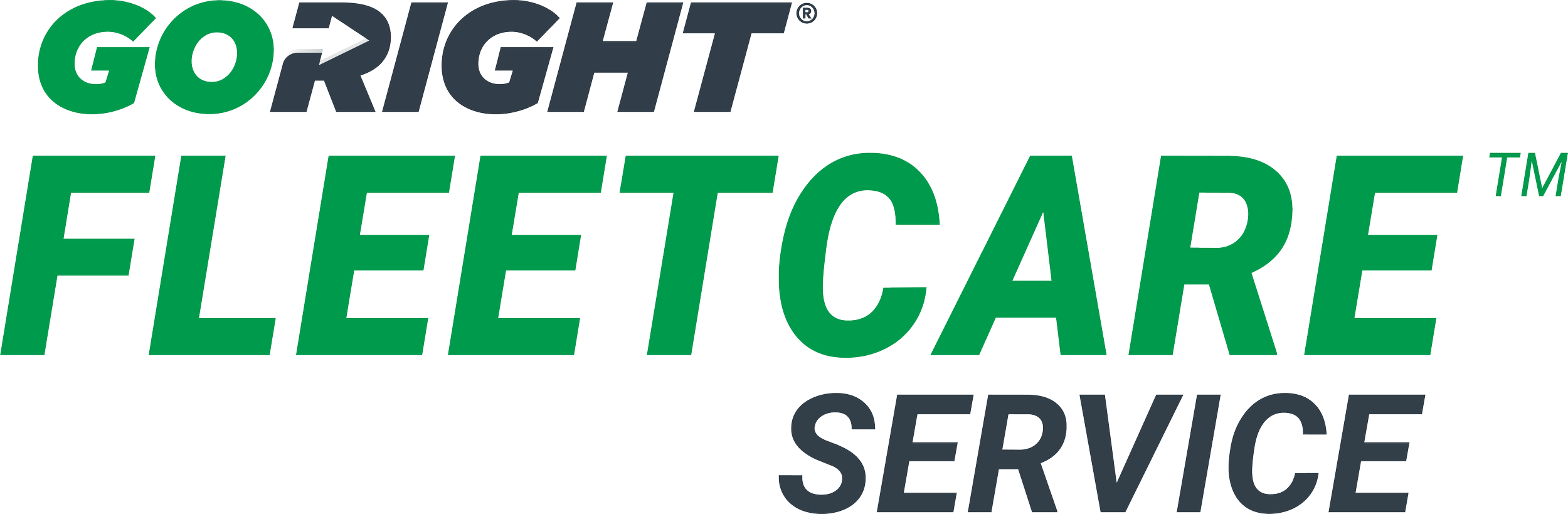
GoRight FleetCare Service
Tasked with designing a new logo for GoRight FleetCare Service, my goal was to embody both our established brand identity and the critical element of speed-to-service. My creative process began with extensive brainstorming and sketching, exploring various visual metaphors for efficiency, reliability, and precision. I considered dynamic lines and abstract representations, always aiming to ensure any new design felt like a natural extension of the overarching GoRight brand through consistent color palettes and typographic sensibilities.
Here, various conceptual approaches can be seen, each evaluated for its scalability and versatility. While exploring these different iterations, the first design consistently emerged as the favourite. Its strength lay in its deceptive simplicity; it perfectly conveyed the agile and dependable nature of FleetCare Service through clean, classic lines that resonated most strongly with our pre-existing branding. This choice ensured seamless integration while powerfully communicating the swift and reliable support customers could expect.

Wabash Canada
Established in 2005, Wabash Canada, now based in Mississauga, Ontario, is the Eastern Canadian dealership of Wabash National semi-trailers, serving a wide range of fleet clients. Leading into a comprehensive company rebrand in 2024, it was crucial to modernize their visual identity. The original burgundy, black, and white logo, dating back to the early 2000s, no longer aligned with the company's forward-looking vision.
The new logo directly supports this 2024 rebrand, drawing inspiration from the contemporary branding of Wabash National (the parent company) while thoughtfully integrating the established and recognizable maple leaf from the original Wabash Canada mark. This strategic approach creates a clear visual synergy with the parent brand, reinforcing their affiliation and leveraging brand recognition, all while celebrating Wabash Canada's distinct Canadian identity. The transition to a clean blue color palette offers a fresh and professional look that resonates with their diverse client base and signals the company's evolution. This redesign was a key element in a broader initiative to elevate Wabash Canada's brand presence in the competitive transportation industry for 2024 and beyond.
Original logo - 2005
Redesigned logo - 2024
Official logo
Your Gratitude Girl
"Your Gratitude Girl" is a deeply personal project, born from the publication of my Amazon books, "Your Journey: Finding Gratitude and Yourself" and "Finding Happiness: An Activity Book to Reduce Stress and Cultivate Joy." This endeavor represents a complete end-to-end creative journey, where I designed and brought to fruition every aspect of the brand.
From conceptualizing and writing the books themselves, to developing the entire brand identity, and creating all content across Instagram, TikTok, and Facebook (@yourgratitudegirl), this platform is a testament to my ability to transform vision into a tangible, engaging experience. I also established a dedicated email subscription service, offering exclusive tips, tricks, and bonus tools like gratitude kickstart guides and checklists, fostering a direct connection with a growing community seeking to cultivate happiness. This project showcases my comprehensive skills in branding, content creation, digital strategy, and a passion for impactful communication.
Branding
This project allowed me to fully define and articulate a brand's essence from the ground up, reflecting its core mission of cultivating joy and gratitude. My process involved meticulously designing the signature logo, featuring flowing typography and a vibrant colour palette chosen to embody uplift and a lighthearted spirit. I then developed a comprehensive visual language, establishing a dynamic colour scheme, complementary typefaces, and a suite of custom brandmark icons. Each design decision was made to build a warm, approachable, and memorable presence that deeply resonates with the audience and visually reinforces the message of finding happiness.

Social Media
Through a curated mix of daily theme posts, I deliver actionable tips, inspiring quotes, and engaging prompts. The visual consistency in the grid leverages the brand’s signature bright colours and heartfelt imagery, creating an uplifting and recognizable feed.


